J’ai une petite anecdote à vous raconter.
Depuis que je suis revenue à Bruxelles, je suis en recherche perpétuelle de la « beach vibe ». Certainement parce que c’est ce que j’ai connu ces dernières années. Ou alors parce que j’ai besoin de vacances!
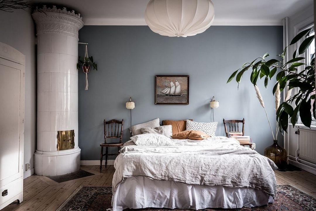
Toujours est-il que, pour la décoration de ma chambre, moi choix était assez facile et rapide : il me fallait un bleu poétique. Pas trop bleu, pas trop clair, pas trop foncé, avec la juste dose de gris dedans. Oui, Je ne suis pas compliquée mais … 😉
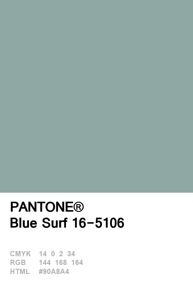
lorsque je suis tombée sur le Pantone ‘Blue surf’, j’ai eu le coup de foudre immédiat. Il cochait tous mes critères de bleu poétique parfait.
Le vision Board :
Très vite, je partais sur le tableau de visualisation.

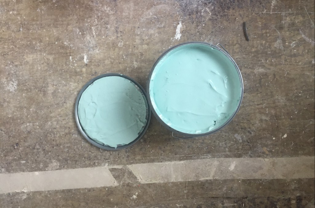
Et puis hop! lorsque je me suis mise à l’attaque; le résultat était un gros flop!
Bon, ceux qui me connaissent savent déjà que j’ai trouvé une solution rapide à mon problème. Voici le lien vers la suite de l’aventure.
English version here
Here is a little anecdote. My journey to finding the perfect poetic blue.
Being in the city, I found myself longing for a beach vibe & closeness to nature. So, when I came to choose the colour for the bedroom, I knew I wanted a « POETIC BLUE ». I wanted a peaceful, calm, secure and serene feel.
I needed to find the perfect tone that would marry the ocean and the sky. A rather shady blue…Yet more blue than grey as the light in the bedroom is rather limited. I found this perfect ‘blue surf’ pantone. It was exactly what I wanted. It felt so poetic to me !
Or so I thought ! (you’ll have to keep on reading to understand my thinking…)
I’ll be honest here, it took me some time and hesitations ! I NEVER even thought I was a « blue » kinda girl.
Choosing paint colours for your interior requires some questioning and introspective time. It can be tricky to decide for the right colour, tone, nuance,…
So here is how my questioning/decision making process went:
THE VISION BOARD:
The Colour Symbolism
I believe in therapy of colours, also called chromotherapy.
To me, it is non verbal communication.
All colours have a certain vibration that can either be very healing and grounding or – on the contrary, totally agitating and confusing.
So, I always take that into consideration whenever I’m choosing colours for my interior (or my clothing!).
I simply ask questions: what message do I want to communicate ? and how does this colour make me feel ?
Of course some people have more sensitivity than others.
And I think I became more sensitive over time…
As you may know, all colours have meanings too. It is very personal but also varies from cultures.
As explained in this article, blue is a dichotomous colour because it bears both positive and negative meanings.
The common meanings of blue for both America and Western Europe are trust and serenity, as well as depression and loneliness. It all comes down to the type of blue you choose I guess.
Ps; did you know that for Hindus, blue is connected to Krishna who symbolises love and divinity, and thus represents immortality ?!

Tastes, needs and mood
I love spontaneity but painting walls is not something I wanna do twice a year ! So, I want to make sure it is a well thought process.
First, remember that moods, like trends change and vary (especially as a woman!ha ha!) so I had to acknowledge it and I waited some time before making a decision.
I wanted to see if my ideas and feelings were changing and they most definitely did !
Also, as we grow up, our colour choices and needs evolve.
So my questions to myself were: where am I at in my life ? What are my needs ? What are my desires ? How do I want this room to feel ?
Of course, I am not who I was 10 years ago, and my tastes and needs for colours have changed over the years. As a teenager, I used to love bright reds. But if I were to have bright red in the bedroom today, I honestly couldn’t sleep ! In my early twenties, I was very much into purples and pinks. Let me tell you: that boat has sailed too. Sure, my love for pinks remains but not for my bedroom. And I appreciate soft tones better now.
I often say that the wardrobe is a good indicator of your general style and taste. So it deserves to be observed when painting your interior.
Over time, my personal style became more classic/ casual chic with lots of neutrals, a sporty twist (sneakers with a skirt – The California style- ) and a touch of originality with a few splashes of vibrant colours here and there. Nothing over the top… Simplicity is key ! Most importantly, I focus more on quality than quantity now.
All that reflects in my interior. And it is definitely impacting the way I decorate my home.
Personal style and Cohesiveness
As said before, your personal style influences your colour palette.
I had to ask myself that question many many times to understand what my style was. Until then, I thought I knew but it wasn’t clear enough. A clear vision is what we need ! Because you don’t want your home to be a generic copy or a mishmash… You want it to FEEL RIGHT and PERSONAL!
Of course, it is easy to determine what you like… It is important to really envision and decide what you want your home to look & feel like. It should reflect on who YOU really are ! So for that, you need to ask yourself that same question: who are you ?
To help me with that, I created Pinterest albums and collected all pictures that were translating with my tastes. then I started eliminating the pictures that where not who I really was…
I’m not just one style of course. That would be too easy! No one ever is !
It seems I’m more of a scandi – contemporary kinda girl, with a vintage + – ethnic – boho chic twist. I want the general scheme to be cohesive and translate into a place where Paris meets L.A. and Ibiza).
To achieve coherence: harmony, rhythm and repetition are key.
– Just like when reading a book, there is a story to understand through correlations and linking words –
I love natural tones, soft pastels, nudes, wooden floors and furnitures as well as prints, patterns and dramatic black… Those elements will repeat and appear throughout the apartment.
To decide on the colour palette and find harmony, I make my pantones and swatches sit next to each others so to look at the bigger picture – Just like when choosing a capsule wardrobe. Ideally, if it is pleasing to my eye, it should be good in 3D too.
When I started painting the bedroom wall, I had took a step back a couple of times so to observe the general look and the transitioning from one room onto the next and make really sure it was cohesive.
Room, exposure and light
Before buying the paint, I thought I had taken everything into account.
Even the sun exposure. It seems silly but it is important ! Because you may know that : the light and colours will appear differently in a room that is facing North OR South and if the wall is next OR opposite the window…
BTW ! A little « rule » that applies to the Northern Hemisphere :
A/ Natural light coming from the North/East side seem cooler, almost blue whereas the light from the South/West side appears warmer, almost orange/yellow… This can have a big impact on the colour!
B/ The wall that is opposite the window will be brighter (more luminous) than the ones just next to the window, that will appear darker/ grey-er.
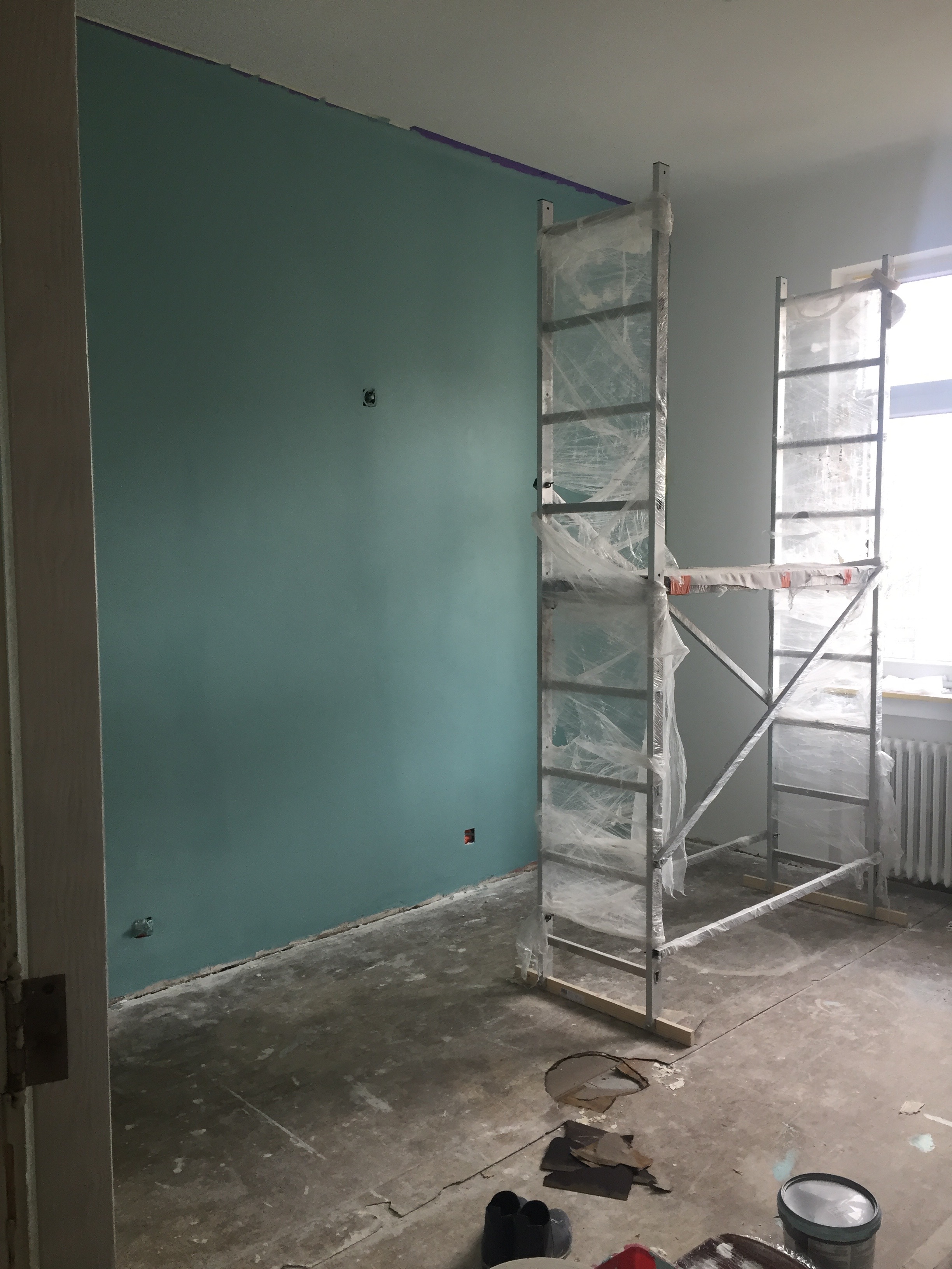
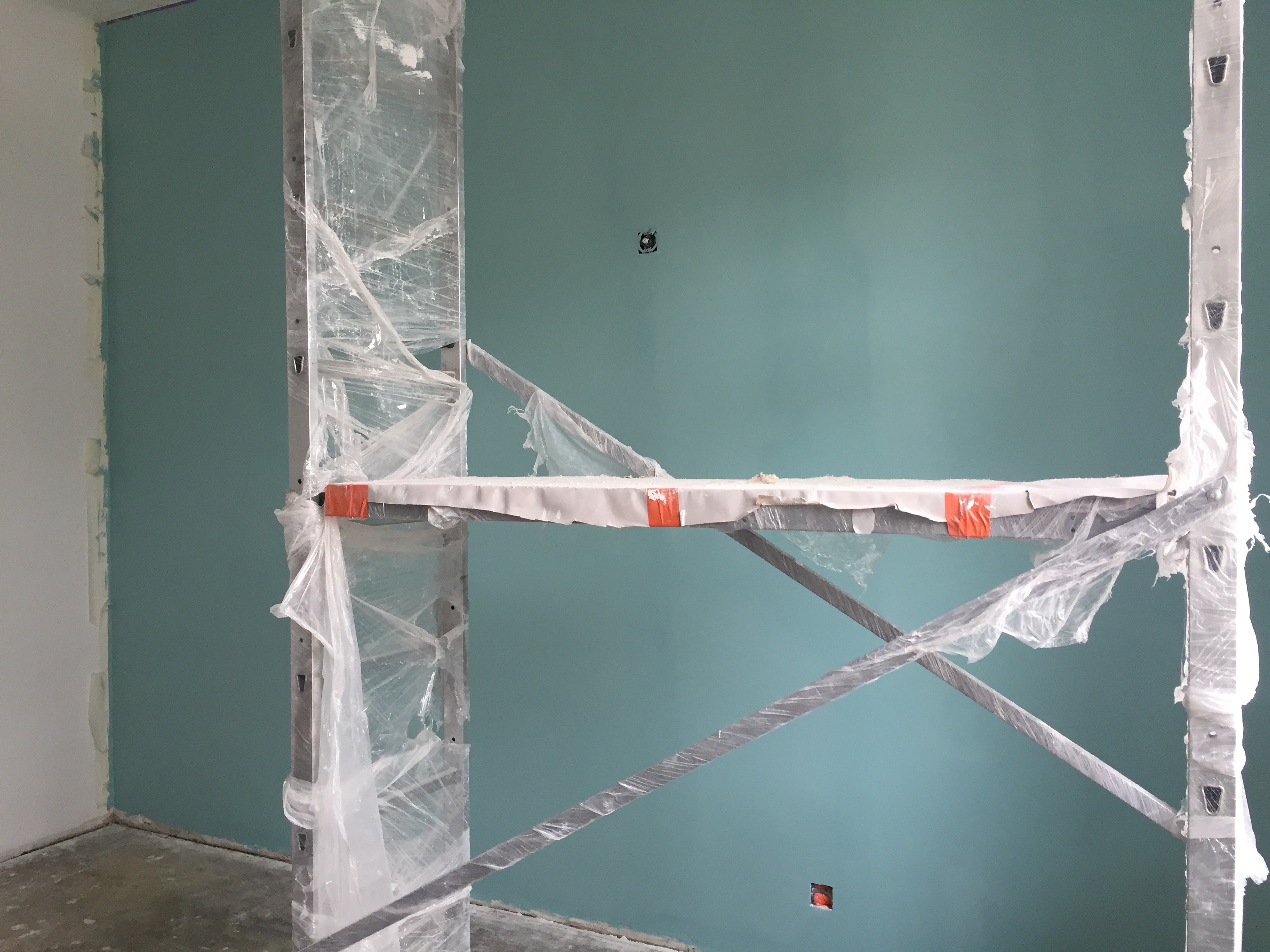
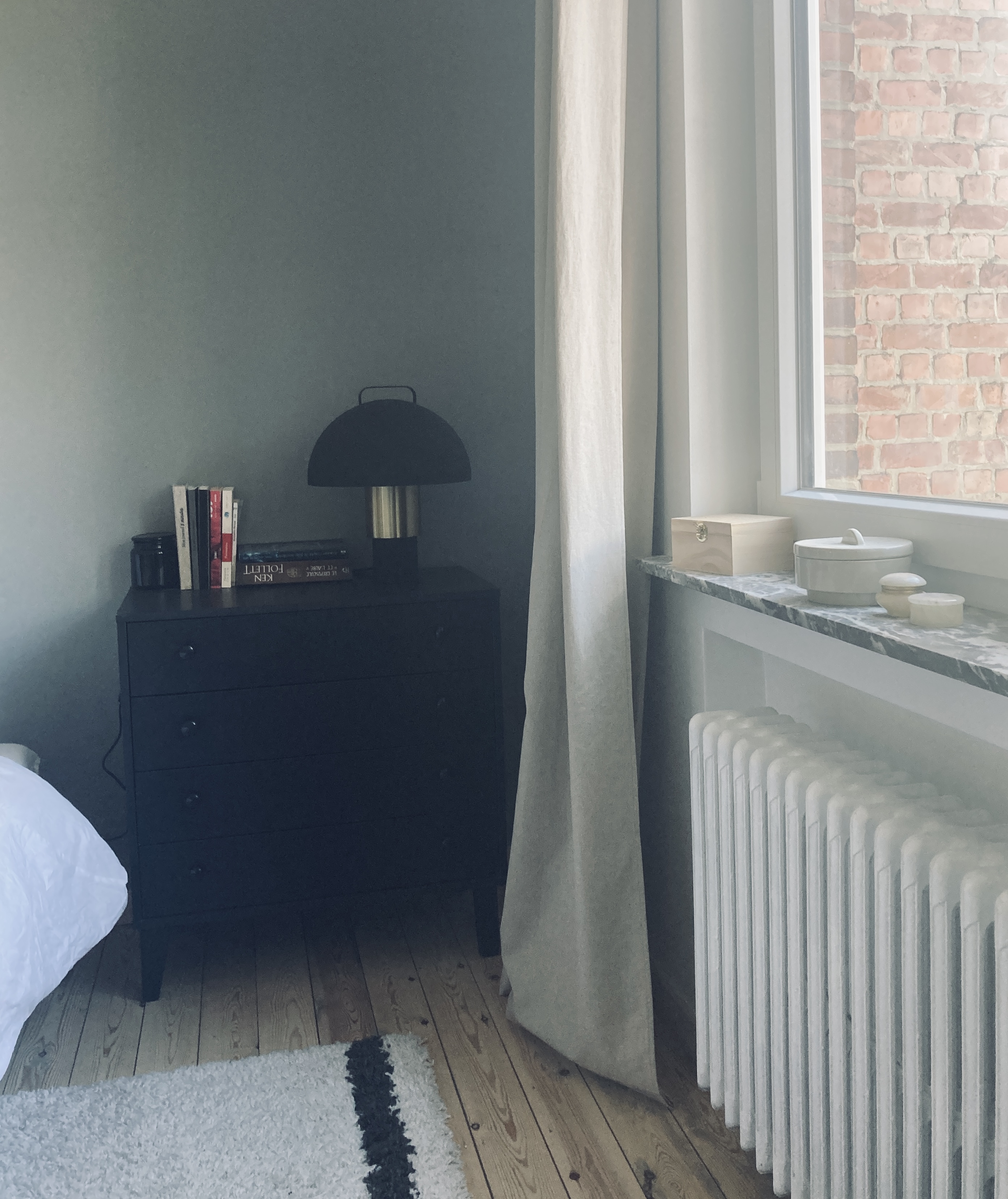
The wall I decided to paint was just next to the window and the room doesn’t get much light from Northern exposure.
After all that, I was ready to purchase and ready to paint! Then:
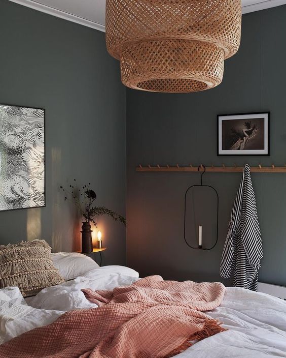
I quickly realised it was absolutely not OKAY to feel like in a hospital in my own bedroom. This colour felt wrong to me …
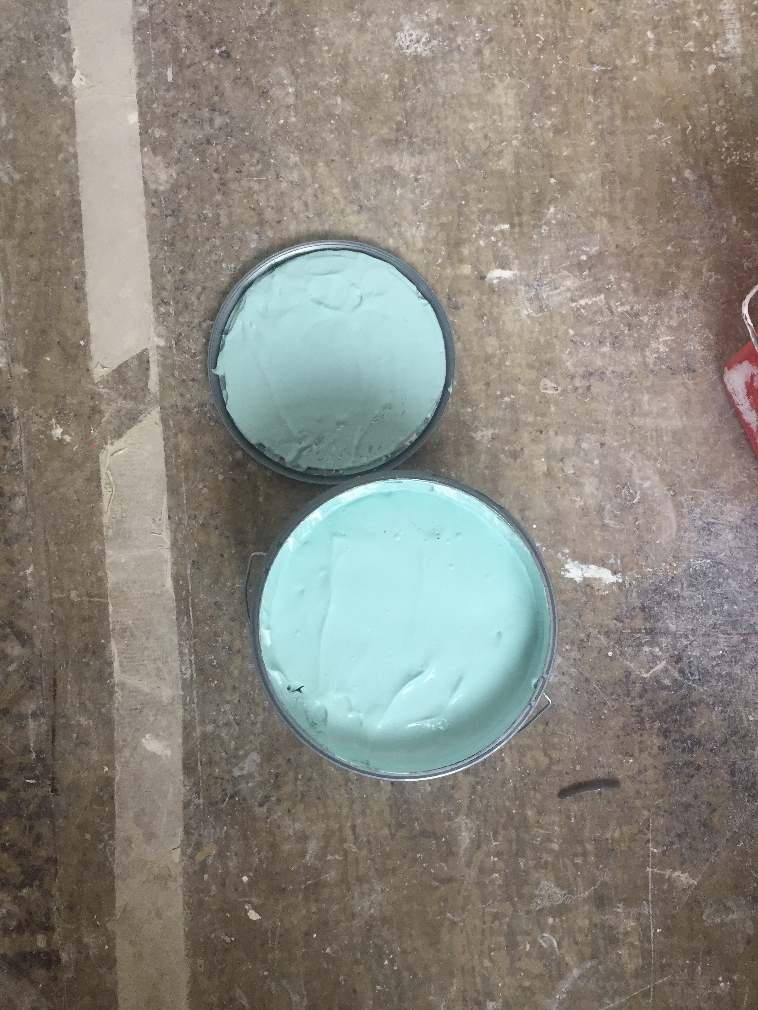
I understood I had never really tested it for real (on the wall itself) and that – my friends- is key!!! A crucial step that I had skipped with my impatience and utter positivity 😉
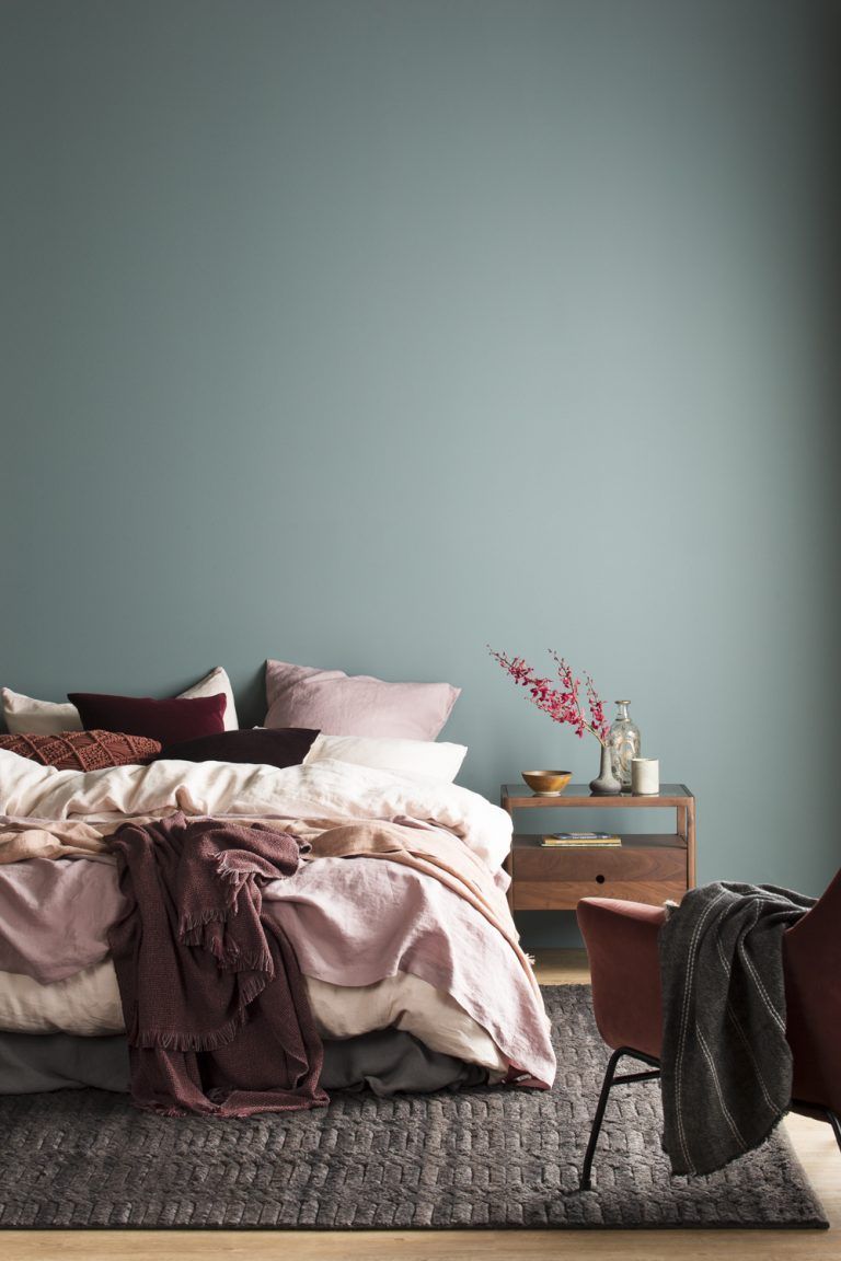
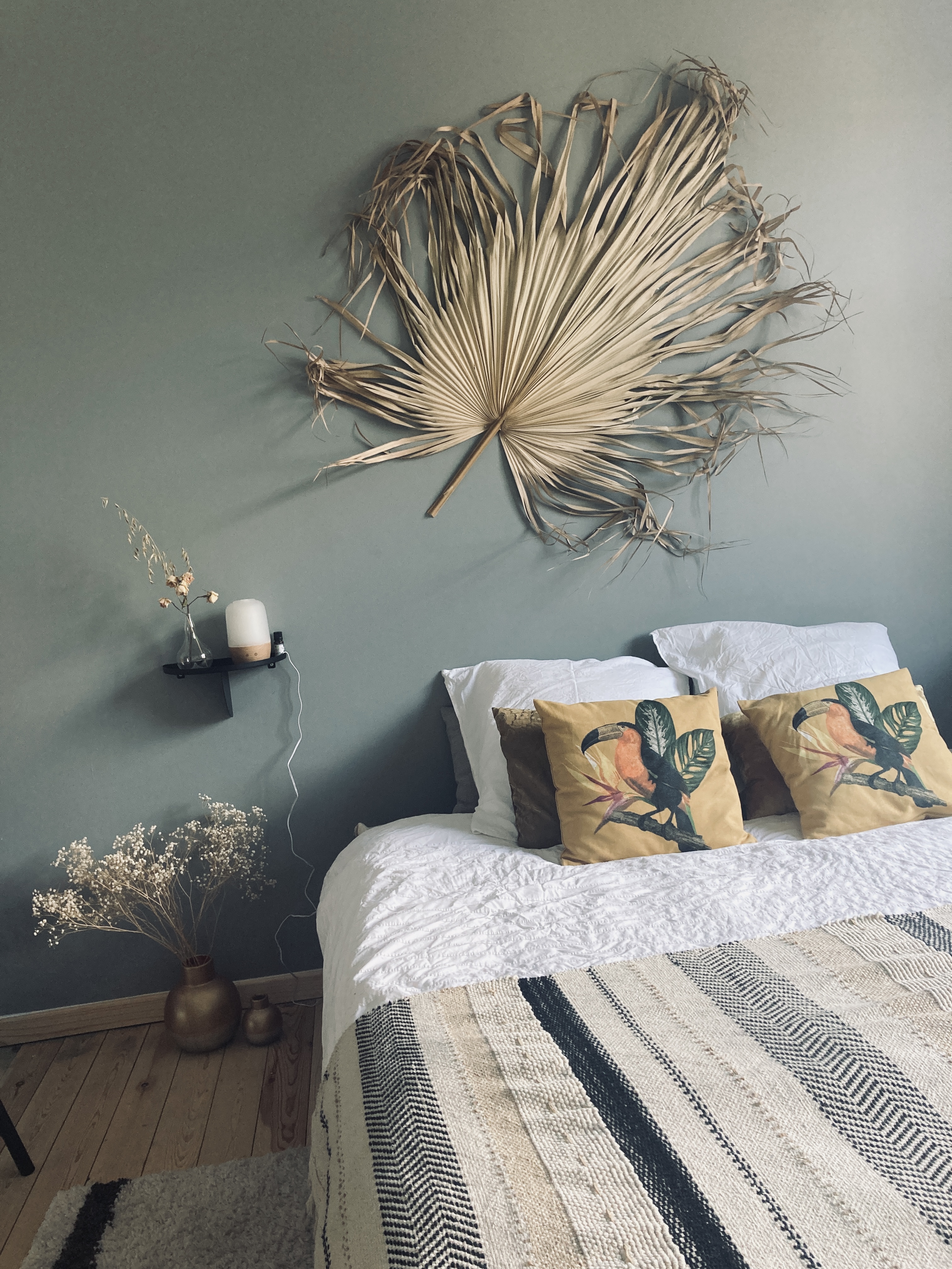
So, I went back to the paint store and found a solution that, then, became my best choice and makes me happy every day/night since then. It is even better than what I had envisioned !!!
This, now, IS the perfect tone that marries the ocean with the sky. A beautiful poetic blue ❤
And you, what colour(s) would you choose for your bedroom?
Axelle
